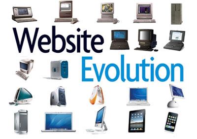
Websites are becoming increasingly important in every industry, and the pool and spa business is no different. While company owners and managers don’t need to be high-tech wizards, they should develop at least a working knowledge of the latest Web trends. To help you speak the language with IT folks, here are six trends in Web design that are altering the look and functionality of today’s sites:
1. Responsive design
The smartphone is changing the way people view the Internet. In fact, 25 percent of Americans do most of their Web surfing on phones rather than a computer, according to a Pew Internet Project report. Web design must now accommodate screens of all sizes, from phones to tablets to laptops.
“Responsive Web design” is a new concept that uses fluid grids that allow a site to auto-scale its layout and design to fit the screen being used. The alternative is building an entirely separate site optimized specifically for mobile. Choosing which option is best for your business depends on your budget and site’s content.
Re-designing an existing site to be responsive will cost more than creating a new site for mobile devices. Yet building a responsive site from scratch costs less than building both a traditional and mobile site. As another option, vendors such as WordPress provide user-friendly Website templates that accommodate responsive design, which makes it easier to migrate your information.
Note: Highly interactive sites (those with a lot of video, slideshows, images, etc.) will run more slowly on mobile devices, even when made responsive. In these cases, it’s best to create a separate, scaled-down mobile site.
2. New languages
The mobile revolution is affecting Web design down to the basics. Most sites are built using HTML (to create the skeleton) and CSS (to control the aesthetics). The newest iterations, HTML5 and CSS3, are fully functional on mobile screens.
Another advantage of HTML5 is its ability to support audio and video without a Flash player, which doesn’t work properly on many mobile devices. Once dominant in Web design, Flash is quickly being replaced by jQuery, which uses the JavaScript language to create slideshows, popups, forms and other effects.
3. Simple look
Site designs are becoming increasingly minimalist, sharply focused on the users’ needs. Simple, intuitive interfaces with fewer pages and elements make navigation easy.
The goal is to impress users with valuable content around a key idea, not dazzle them with design or overwhelm them with marketing messages.
4. Super sized
A focus on minimalism will force designers to find new ways to create visual impact and make a lasting impression. Expect to see more oversized logos and large background images. Headers may take up the entire page but allow users to scroll down for more content, rather than forcing them to click anything.
Large photos make a big statement and are already increasing in popularity (see Facebook’s new Timeline design). More sites also will incorporate high-resolution images as page backgrounds that demand attention.
5. Custom typography
If your site still uses Times New Roman and Arial fonts, it may soon look as old-fashioned as a flip-phone. In the past, fancy typefaces required designers to build images that bogged down a site’s performance. That has all changed.
New custom-font tools (Google Web Fonts, Typekit, CSS Type Set, Typetester, What the Font) allow designers to embed a bit of JavaScript code into their CSS style and, voila, the fonts are automatically displayed without slowing the site or forcing users to download anything.
6. Social media integration
It is already nearly impossible to find a Website without social media features, but in the past the elements have often been relegated to the footer as an afterthought. Expect to see Facebook, Twitter and the like take starring roles on sites to increase interactivity. Making it easier to for visitors to connect profiles and share content will increase customer engagement and increase unique Web traffic.


