At the end of very year, certain manufacturers of paints, inks and other products or materials designate the next Color of the Year.
The color developer Pantone leads the way and gains the most splashy media coverage. In the last few years, it has ushered in vivid and bright hues that are picked up fairly quickly by the fashion, cosmetics and other industries.
The most prominent colors of the year come from Pantone and Benjamin Moore. While very different,they often fulfill the same needs.
Several producers of interior and exterior paints declare their colors of the year as well. Benjamin Moore, Sherwin-Williams, Behr and PPG Paints each released their own color of the year for 2019, with some also suggesting hues for pairing.
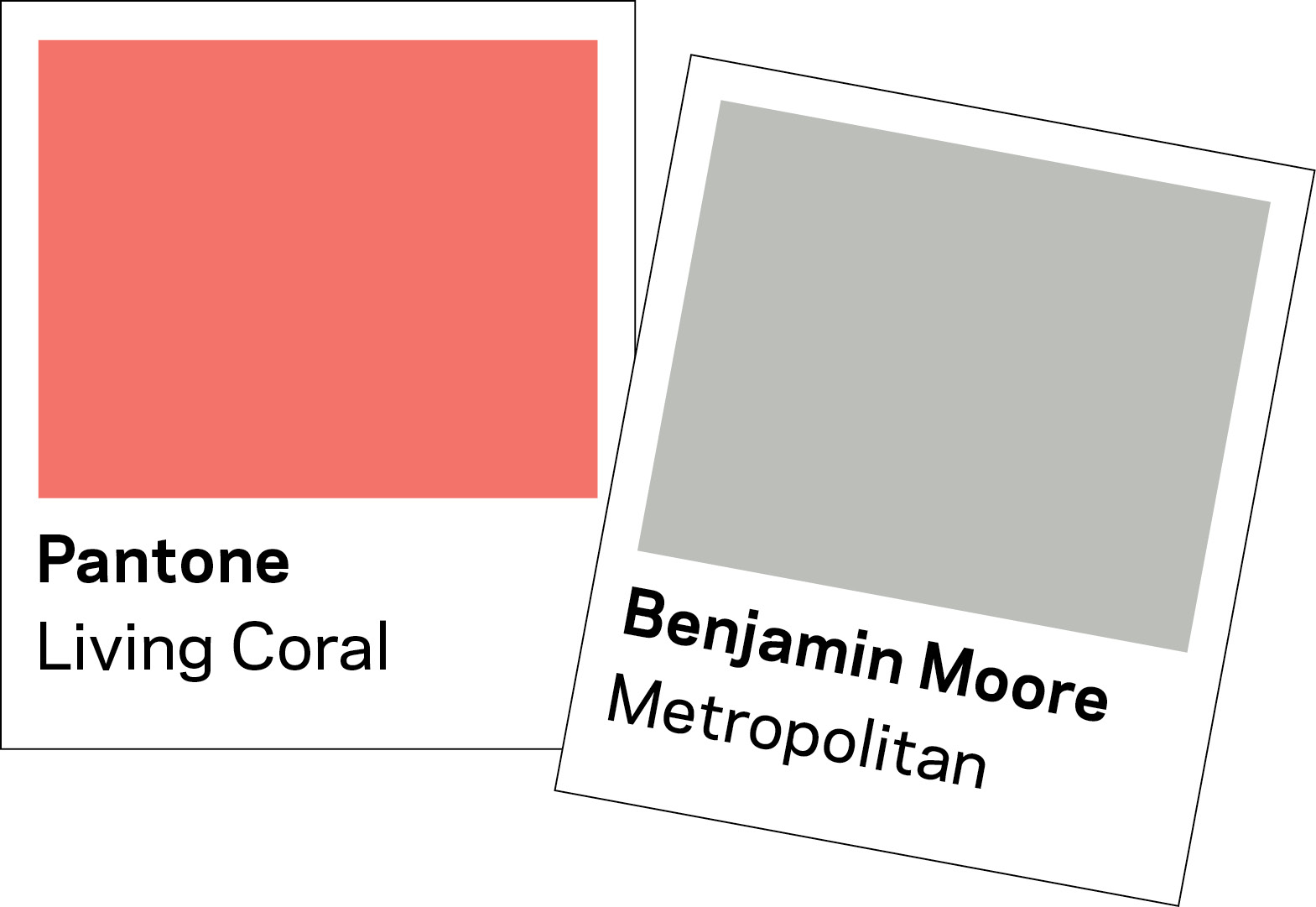
But these colors seem all over the map. The 2019 Pantone Color of the Year is called Living Coral, described as “an animating and life-affirming coral hue with a golden undertone that energizes and enlivens with a softer edge.”
Benjamin Moore, which has named colors of the year the longest among paint makers, recently gave the honor to Metropolitan, a mild gray with cool undertones. Described as “comforting, composed and effortlessly sophisticated,” the tone could hardly be more different than Pantone’s.
The others seem to fall in between: Sherwin-Williams’ Cavern Clay is an orange-tinged brown described as “ancient, yet full alive. ” Behr released a grayish blue called Blueprint: “Warmer than denim and softer than navy …” PPG Paints’ Night Watch is a medium-to-dark bluish green said to “allow spaces to emulate the feeling of lush greenery and the healing power of nature.”
So what do these colors mean, when you have a coral, a gray, a glue, a brown and a green? And how can they be used by backyard designers?
Taking the temperature
Based on insights from Feras Irikat, who teaches color theory for pool-industry education group Genesis, perhaps some of us were taking the Color of the Year designations too literally.
These hues are serious business, according to the director of design and marketing for Lunada Bay Tile in Harbor City, Calif. Pantone and Benjamin Moore, in particular, are known for performing extensive research over months and even years to pinpoint one color for each year.
In part, the colors of the year represent a recording of recent trends and how the companies expect them to evolve. But these companies also track customer mood and preferences. “They gain more psychological and emotional understanding of where the consumer is in their life,” Irikat says. “They view color not just as an aesthetic [component]. They view it as a functional product that you could incorporate into your life to make it better.”
In performing this research, the companies have come to the same conclusions regarding America’s collective mood: “I think it’s coming from the turmoil, chaos, crazy-busy, politically and economically charged times,” he says.
But how does that manifest in Pantone’s pinky orange and Benjamin Moore’s quiet gray? Each company is providing a different antidote to the same mindset, Irikat says. While Pantone looks for a hue that will energize and boost one’s mood, Benjamin Moore generally seeks to help create a calming environment.
“There’s no right or wrong — there’s an audience for each one,” Irikat says.
Designer Springboard
The job of the designer, then, is not necessarily to add a Living Coral wall or a Metropolitan pool interior: It’s to assess whether any of these tones make a good fit for your client’s personality and mood, then use them as a jumping-off point.
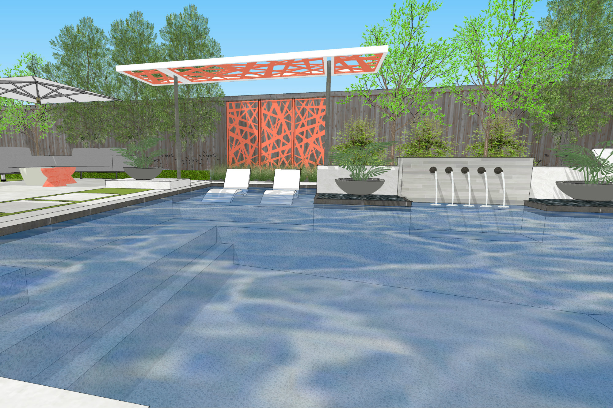
Sure, you could use the colors as presented in the swatches and paint chips, adding a Living Coral throw pillow, an accent wall or border in Cavern Clay, or even bringing Blueprint or Nightwatch (the green) into the pool.
But some designers gain more from analyzing the colors of the year to detect commonalities. For the past few years, Kate Wiseman, principal designer at San Diego-based Sage Outdoor Designs and a Genesis instructor, has noticed a trend toward colors that are impactful but not bright or vivid.
“There’s something rich and comfortable and slightly luxurious about the new colors,” she says. “Cavern Clay makes me think of hand-made leather goods, like you’d find at a hipster boutique. Even that one, to me, feels like there’s sort of an elegance or expensiveness to it.”
This mood also seems to mesh with what her clients want.
Another designer has a slightly different take that corresponds with the preferences of his customers and himself. Randy Angell also notes that the new hues stray from the more vivid gem tones that we saw in the recent past. But he detects a slightly muted quality to most colors of the year.
“It’s not the bold, brash colors that we sometimes use,” says the CEO of Randy Angell Designs in Plano, Texas. “It’s a bit more powdery. I see that even in Pantone’s Living Coral. It’s not that highly saturated coral color.”
If you do want to incorporate the colors of the year, Irikat says, you don’t need to use them as is. They can be altered with the addition of white or black. Adding black, for instance, turns Living Coral into a backyard-friendly terra cotta, where white could make it appropriate for stucco.
“Adding black and white to any color never changes the qualities or characteristics of colors,” he says. “It also doesn’t change the psychological response that the color generates.”