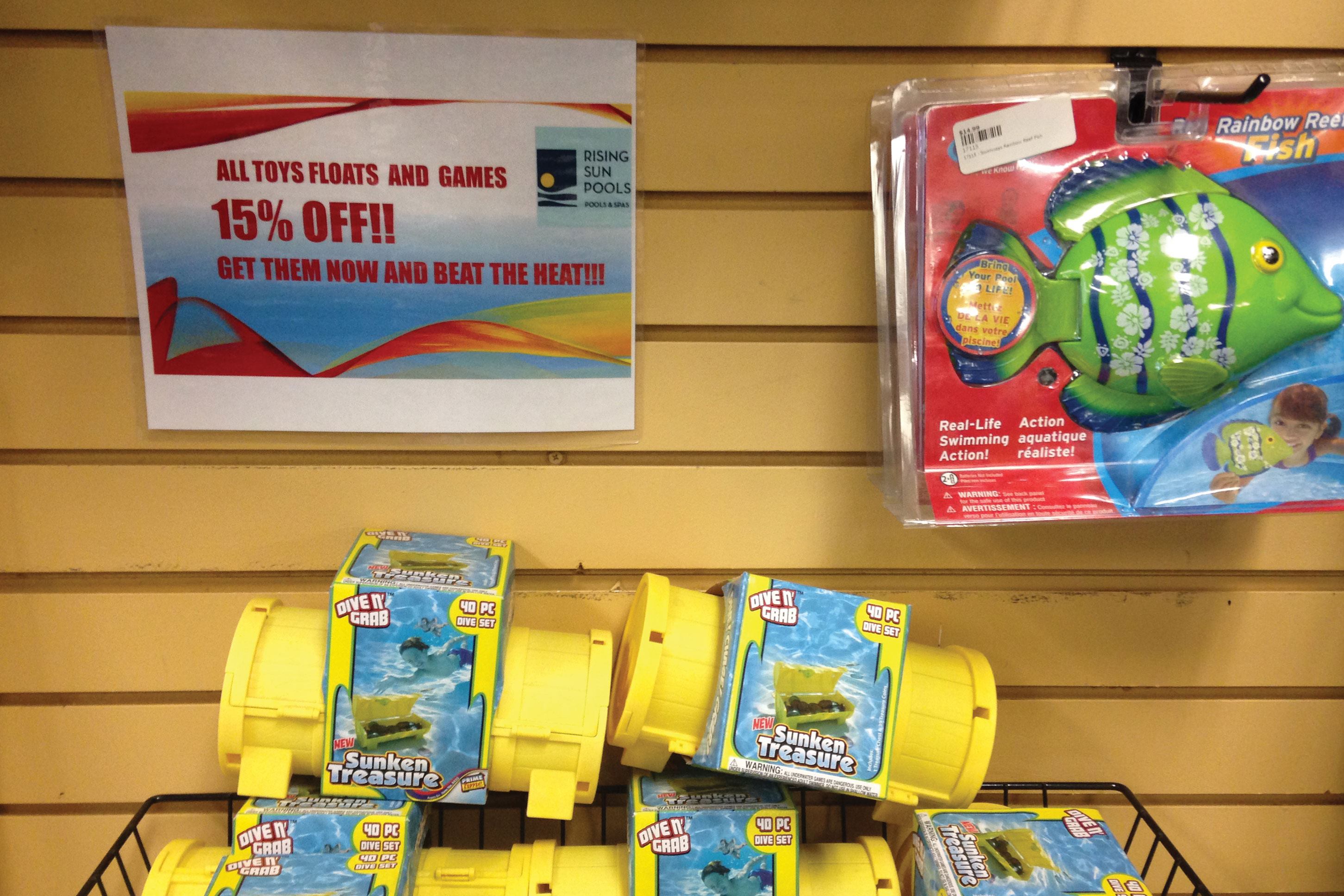
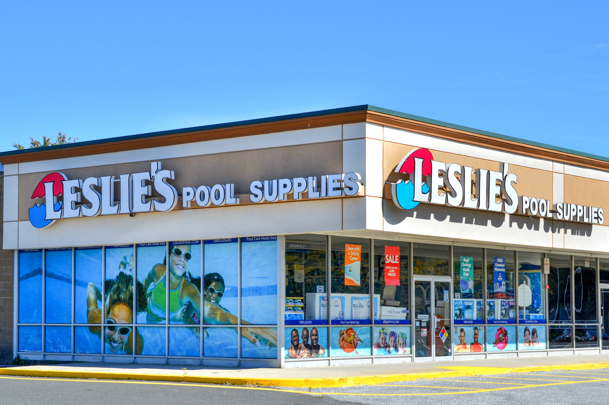
As with everything in retail, signs in the store can be a bit of a trial-and-error issue, but there are some main points store owners should consider. • Color is important. Keeping with the store’s color scheme shows customers that there’s a plan to what’s on the shelf. Other recommendations? Stay away from greens that are reminiscent of algae, and consider red and yellow. There’s a reason those two hues are so popular for fast-food chains: The eye-catching colors and contrast draw consumers’ gaze. “[Success] is not all about the clown,” says Rudy Stankowitz, CEO/president of the Archer, Fla.-based Aquatic Facility Training & Consultants.
SEE MORE: How To Sign the Pool Retail Store Well
• Look professional. Printing wins over handwriting, say experts and retailers. Sure, a store can have handwritten signs with neat and level writing, but it isn’t preferred.“We find the printed just looks more professional,” says Tara Onthank, vice president of retail and marketing at Rising Sun Pools & Spas in Raleigh, N.C. Card stock and lamination also can make signs hold up better over time.
• Be fresh. Rotating product throughout the season is savvy, and changing signage follows the same mindset. Products geared for pool openings in the spring, enjoyment on holiday weekends, and pool closings at the end of the season are minimum suggestions of what to call customers’ attention to.


